I was looking for ways to improve my app, Meshing. Today, I watched this fantastic WWDC 2024 session: Add personality to your app through UX writing.

Coincidently, I was working on the onboarding screen for my app Meshing, and I think it is the best screen to start out and apply what I learned.

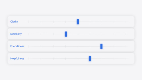
Principles of Writing
The session covered four key principles of writing at Apple:
- Clarity,
- Simplicity,
- Friendliness, and
- Helpfulness
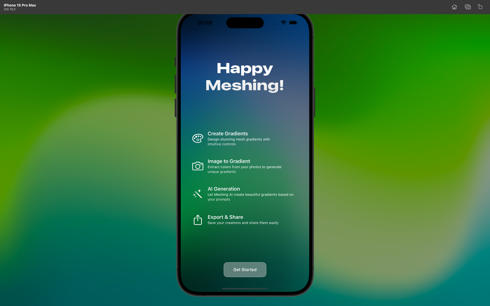
I realized my app's onboarding screen could use some work. Here is what I started with:
let features = [
  Feature(title: "Create Gradients", description: "Design stunning mesh gradients with intuitive controls"),
  Feature(title: "Image to Gradient", description: "Extract colors from your photos to generate unique gradients"),
  Feature(title: "AI Generation", description: "Let Meshing AI create beautiful gradients based on your prompts"),
  Feature(title: "Export & Share", description: "Save your creations and share them easily")
]
Before diving into revisions, I needed to define Meshing's personality. I decided on:
- Creative as an Artistic Soul
- Helpful to Designers
- Inspiring for Wallpapers
- Simple to use
With these personality traits in mind, I worked on each feature description.
Create Gradients
The original title was Create Gradients with the description: Design stunning mesh gradients with intuitive controls.
This description had a few issues:
- The term "mesh gradients" is technical. Many users might not know what it means.
- "Stunning" and "intuitive" are subjective terms that do not provide concrete information. Intuitive definitely sounds AI cliché these days.
- It talks about the controls being intuitive, but does not clearly state the benefit to the user.
The new title: Create and the description: Make beautiful gradients with easy-to-use tools.
- I replaced "Design" with "Make". It is a simpler, more approachable word that feels less intimidating.
- I dropped "mesh" entirely. Users do not need to know the technical term - they just need to know they can create gorgeous gradients.
- The new version focuses on what the user can do ("make beautiful gradients") rather than on the app's features.
- Instead of saying the controls are "intuitive", I described the tools as "easy-to-use".
- The new version puts the user in the driver's seat. They are not just designing - they are making something beautiful.
They are making art.
It now speaks directly to what the user can accomplish, rather than getting bogged down in technical details, something we developers usually love to do.
Empathy. I am still struggling to learn its meaning. I have to put myself in the user's shoes to understand their requirements better. What do they really want to know? How can I communicate that in the simplest way possible?
Image to Gradient
The original title was Image to Gradient with the description: Extract colors from your photos to generate unique gradients.
This description also had some issues:
- "Extract" and "generate" sound like complex processes.
- It does not convey the magic of transforming a photo into a gradient.
- It does not tap into the user's creativity or personal connection to their photos.
The new title: Transform and the description: Turn your photos into one-of-a-kind gradients.
- I replaced "Extract colors" and "generate" with "Turn into". It is a more straightforward, almost magical transformation!
- I kept "your photos" to maintain the connection to the user's personal content.
- Instead of just "unique", I used "one-of-a-kind" to emphasize the special nature of each creation. Each gradient is special.
- I dropped the mention of colors. The user again does not need to know the technical process.
This revision made me think about the user's emotional journey. The earlier description felt like the app is just manipulating colors. But, I am trying to provide an experience where the memories and favorite images of the user becomes something new and beautiful.
I am still getting caught up in the "how" of a feature. I feel the user cares more about the "what" and "why". They want to know what they can create and why it matters to them.
AI Generation
The original title was AI Generation with the description: Let Meshing AI create beautiful gradients based on your prompts.
This description had a few problems:
- It sounds passive. The user is "letting" the AI do something, rather than actively creating.
- It is not clear what a "prompt" is to someone unfamiliar with AI.
- It does not capture the excitement of creating something from just words.
The new title: Imagine and the description: Describe what you want, and AI makes it happen.
- I changed "Let Meshing AI create" to "AI makes it happen". AI will anyway rule the world soon, right? And it sounds almost magical. Because it is.
- I replaced "based on your prompts" with "Describe what you want". It is clearer for users who might not know what a prompt is.
- I removed "beautiful gradients" because it is implied and keeps the focus on the user's input and the result.
- It emphasizes the user's role in the creation process - they are the one with the ideas. AI just makes it happen.
AI can sound intimidating to some users. The word AI may provide an imagery of another Terminator movie in the works.
I want them to feel empowered, not overwhelmed.
Good UX writing, like how Apple does it, is about inviting the user into an experience. I want them to imagine the possibilities, to get excited about what all they can create.
Export & Share
The original title was Export & Share with the description: Save your creations and share them easily.
This description, sigh, again, had a few issues:
- It focuses on the technical aspects (exporting and saving) rather than the benefit to the user.
- "Share them easily" is vague. Ugh.
- Where is the joy the users might feel in showing off their work?
The new title: Share and description: Show off your gradients anywhere.
- I replaced "Save your creations and share" with "Show off". Ah yes. The validation. More exciting and a sense of pride in what you have made. So proud of the art.
- I kept "your gradients" to maintain the personal connection to the user's work.
- I changed "easily" to "anywhere". Specific, suggests freedom and versatility.
- It focuses on the end result (showing off) rather than the process (saving and sharing).
Some might just want to make gradients for themselves, but many probably want to share their creations with others. They want to impress their friends, spice up their Instagram stories, or add some vibe to their Keynotes.
Thinking like a developer again, Rudrank. "Export" and "Share" are features, not benefits. Users do not get excited about exporting files. They get excited about showing everyone something cool they made.
Everyone is still a kid at heart. I hope so.
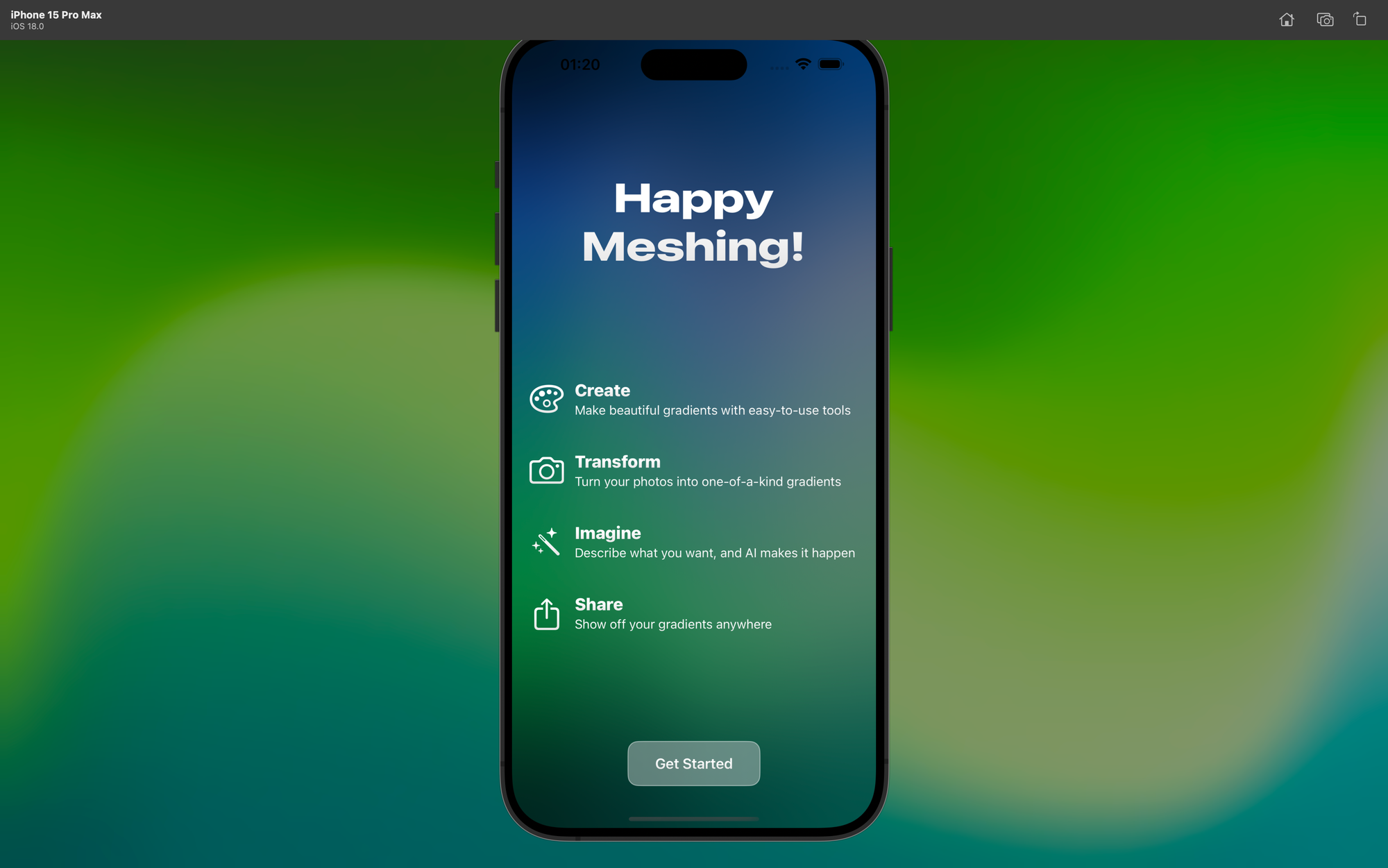
Here is the revised version:
 let features = [
    Feature(icon: "paintpalette", title: "Create", description: "Make beautiful gradients with easy-to-use tools"),
    Feature(icon: "camera", title: "Transform", description: "Turn your photos into one-of-a-kind gradients"),
    Feature(icon: "wand.and.stars", title: "Imagine", description: "Describe what you want, and AI makes it happen"),
    Feature(icon: "square.and.arrow.up", title: "Share", description: "Show off your gradients anywhere")
  ]
Moving Forward
The lesson of the day for me was good UX writing is the difference between an app that people use and an app that people love.
There is always scope for improvement, and I will make it better with each iteration. But, as a developer, I still have to iron out the bugs, and add the last few features to make it ready for release.
I plan to show these new descriptions to Twitter users. I want to see if they resonate, if they are clear, and if they get people excited about using the app.
I highly recommend watching that WWDC session and think harder on the words next time when you jump on Xcode. Are they clear? Friendly? Consistent? Good enough?
We developers are kind of wizards, too. We are creating experiences. And sometimes, the right words can make all the difference.
Happy writing!
